The big furor around
Ikea's changing type font has got me thinking about fonts more than usual these days. A short walk from our house is a light industrial area complete with an abandoned warehouse of sorts. It is chock full of font inspiration.


I love these simple say-it-like-it-is fonts at a larger than life scale. HEATING! DRYERS! OVENS! WHY ARE YOU YELLING!!?

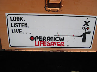
This Operation Lifesaver reminds me of the fonts from my childhood for some reason, doesn't it seem seventies?

But
Men Working Above is my favorite. It is so lovely and tender, I feel like it should say
Unicorns and Fairies rather than issuing a warning
.
 The big furor around Ikea's changing type font has got me thinking about fonts more than usual these days. A short walk from our house is a light industrial area complete with an abandoned warehouse of sorts. It is chock full of font inspiration.
 I love these simple say-it-like-it-is fonts at a larger than life scale. HEATING! DRYERS! OVENS! WHY ARE YOU YELLING!!?
 This Operation Lifesaver reminds me of the fonts from my childhood for some reason, doesn't it seem seventies?
 But Men Working Above is my favorite. It is so lovely and tender, I feel like it should say Unicorns and Fairies rather than issuing a warning.


2 comments:
Great post! Love the fonts and mix of signs, especially like the men working- maybe a bit of photoshop and you could do a keep clear women one...
I really love this post, too! It's out of the "usual" for your blog, and it really showcases your photography skillz. Those fonts are amazing, by the way! you're going to have me chasing old signs around with my camera now, too!
PS: I hadn't heard the IKEA news--shocking!! What will we all do? Seriously, and embarrasingly, "IKEA" was the second word my son could "read" (after "zoo") simply because of the ubiquity of their logo.
Post a Comment